

Create the branding and marketing visual style for a new video game under the Frontier Foundry publishing label.
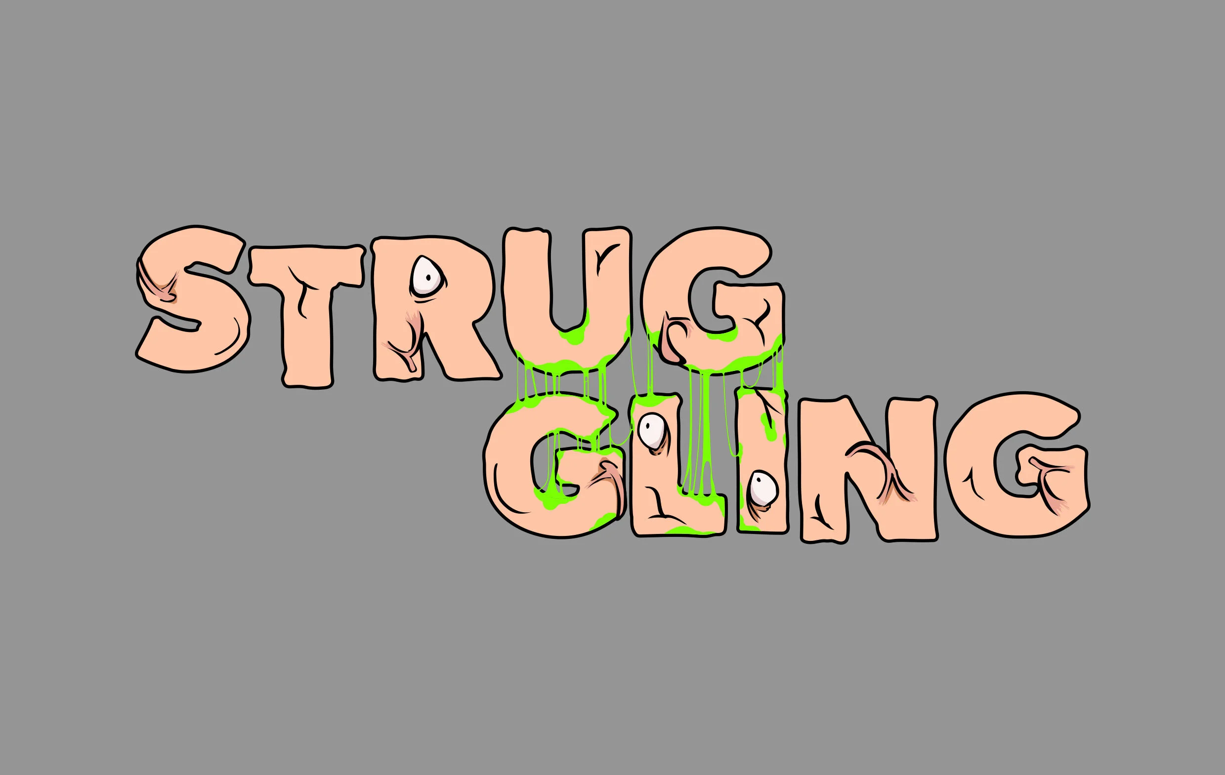
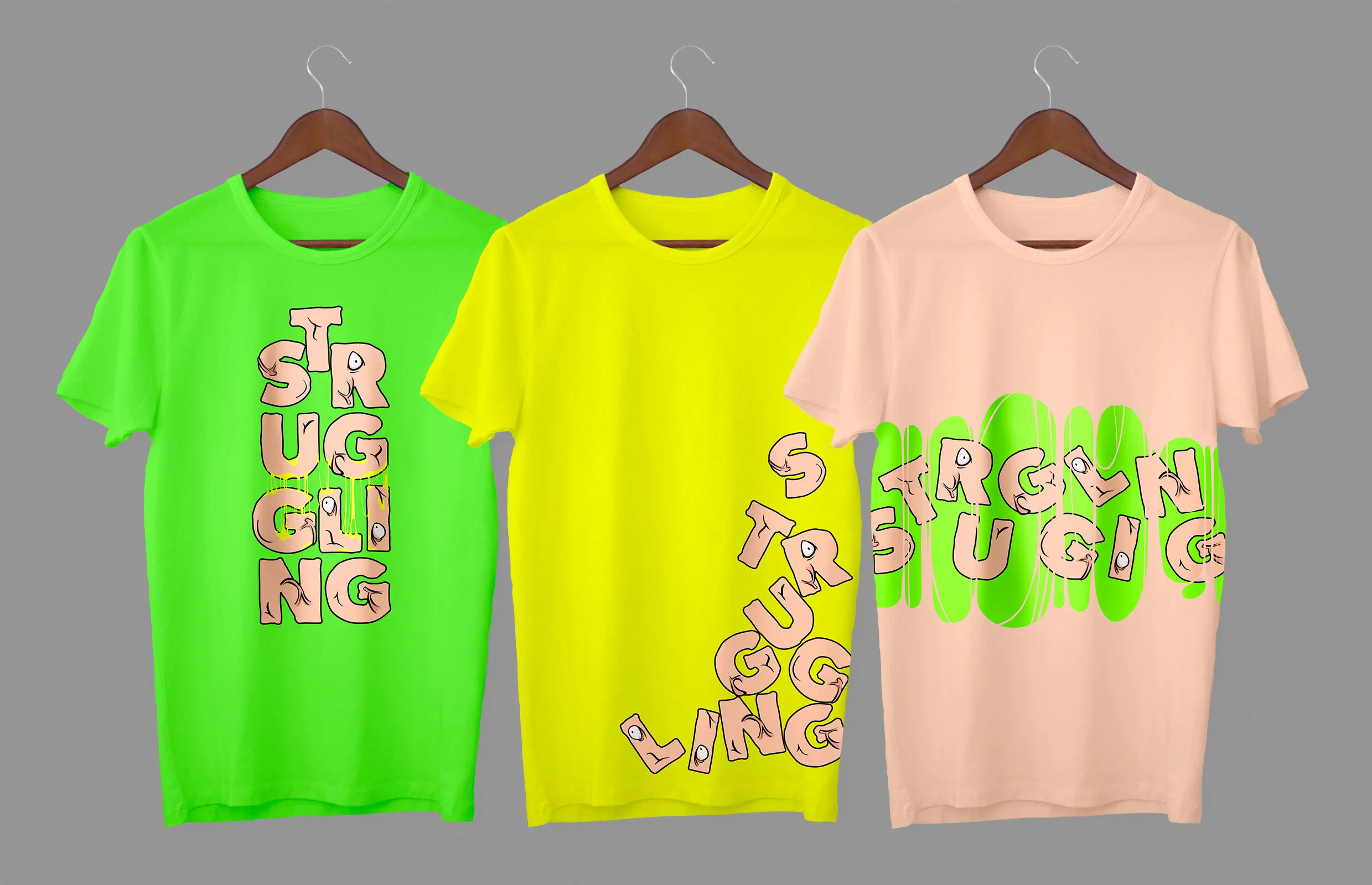
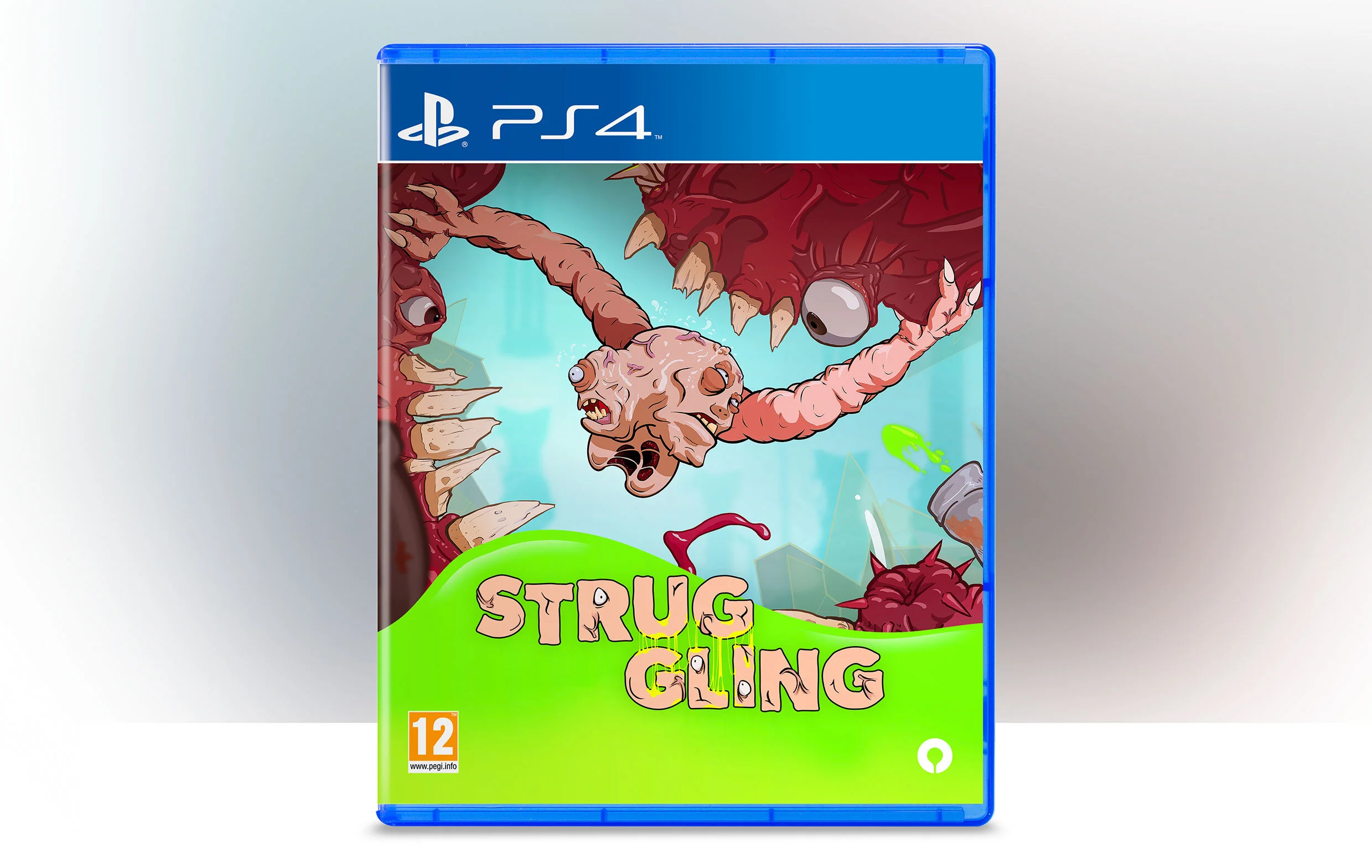
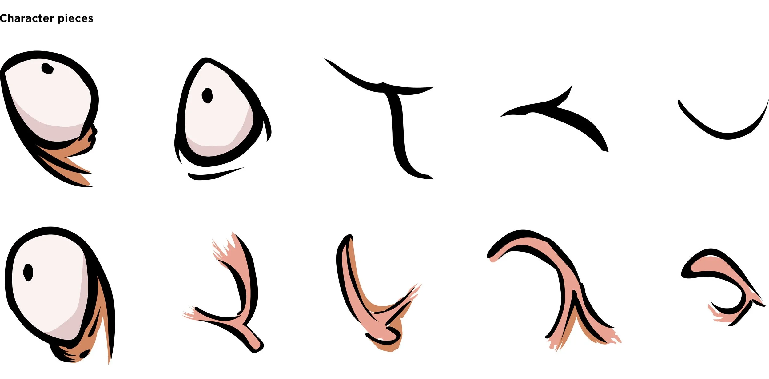
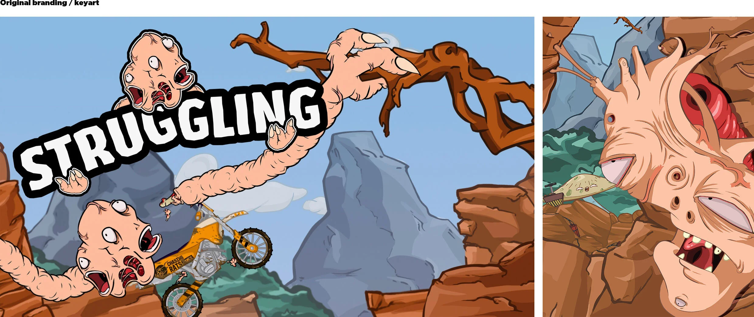
As "Struggling" presented a unique game for Frontier, its branding and visual style needed to be equally distinctive, reflecting the chaotic and visually striking nature of the game itself. Inspiration was drawn from 90s cartoons, Nickelodeon, and experimental shows like "Rick & Morty." While the original branding served as a good starting point, incorporating the character into the logo proved repetitive in key art. Typeface was manipulated by hand, printed out, and then scanned to create unique characters and a thick typeface reminiscent of the main character. Elements of the character were redrawn and integrated into the branding to emphasise its role. A colour palette was derived from the game's elements, such as skin tones, body parts, and radioactive elements. The final version split the text into two parts, "STRUG" and "GLING," reflecting the character's dual nature. The overlapping parts of the type were adorned with radioactive goo, a prominent feature in the game. Merchandise and physical editions were explored to showcase the application of the branding, ensuring that every element remained fun, engaging, and true to the game's essence.