


Update the branding and marketing visual style for a youth theatre workshop company.
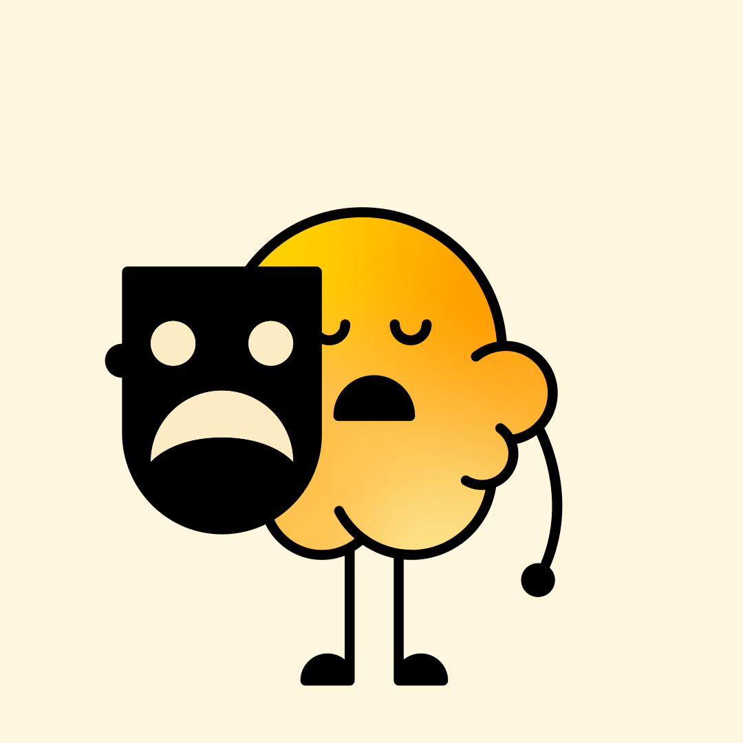
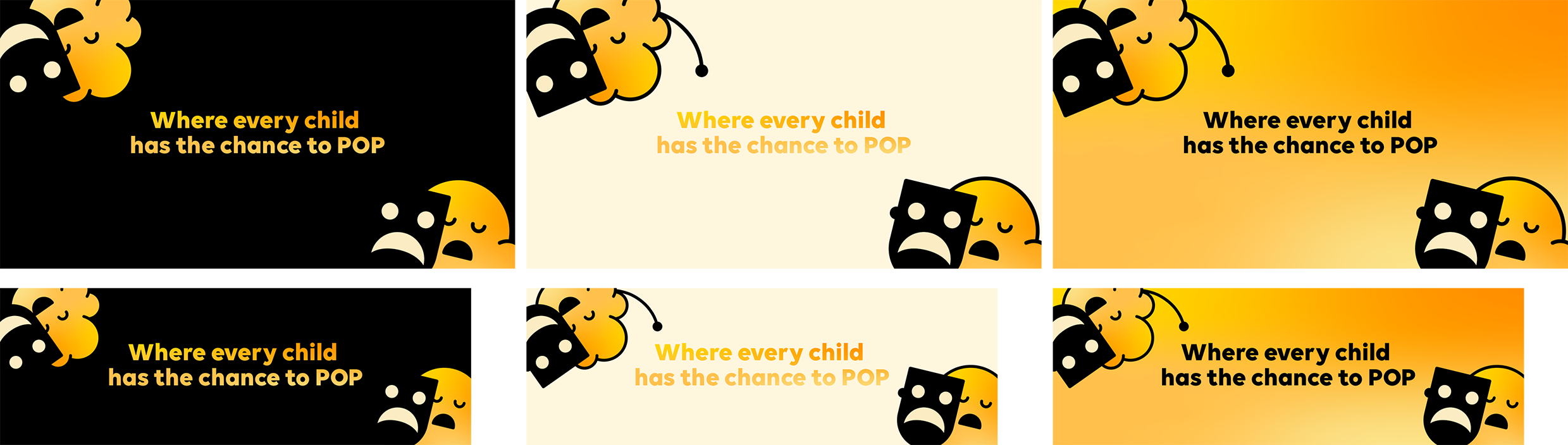
The brand, Popcorn, underwent a significant transformation when passed to a new team, aimed at broadening its appeal across different age groups while maintaining playfulness and modernity. The main logo underwent an update, transitioning to a refined look with a chunky typeface arranged to mimic popping popcorn kernels. Warm tones replaced the previous child-focused colors, and a custom gradient was introduced for a dynamic visual flair. Existing characters were revamped, transitioning to thick, friendly lines inspired by cartoon popcorn shapes. These updates cater to diverse age groups and are designed with merchandise and printed materials in mind. Additionally, multiple social assets were created, aligning with the refreshed brand style.
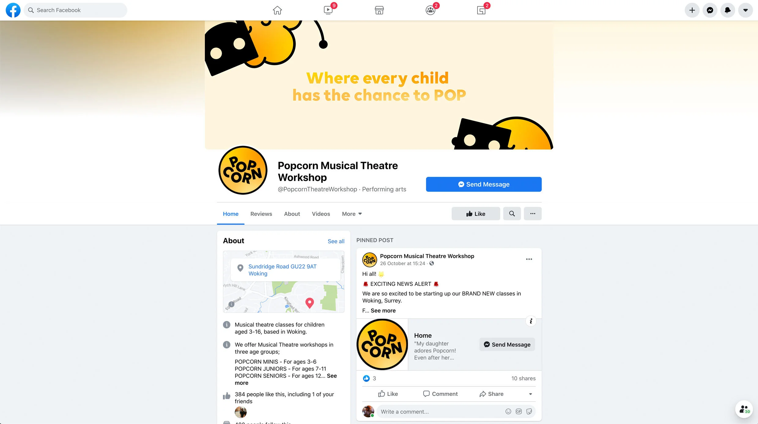
Website