


Create the brand identity around the existing logo as well as the visual identity for each update.
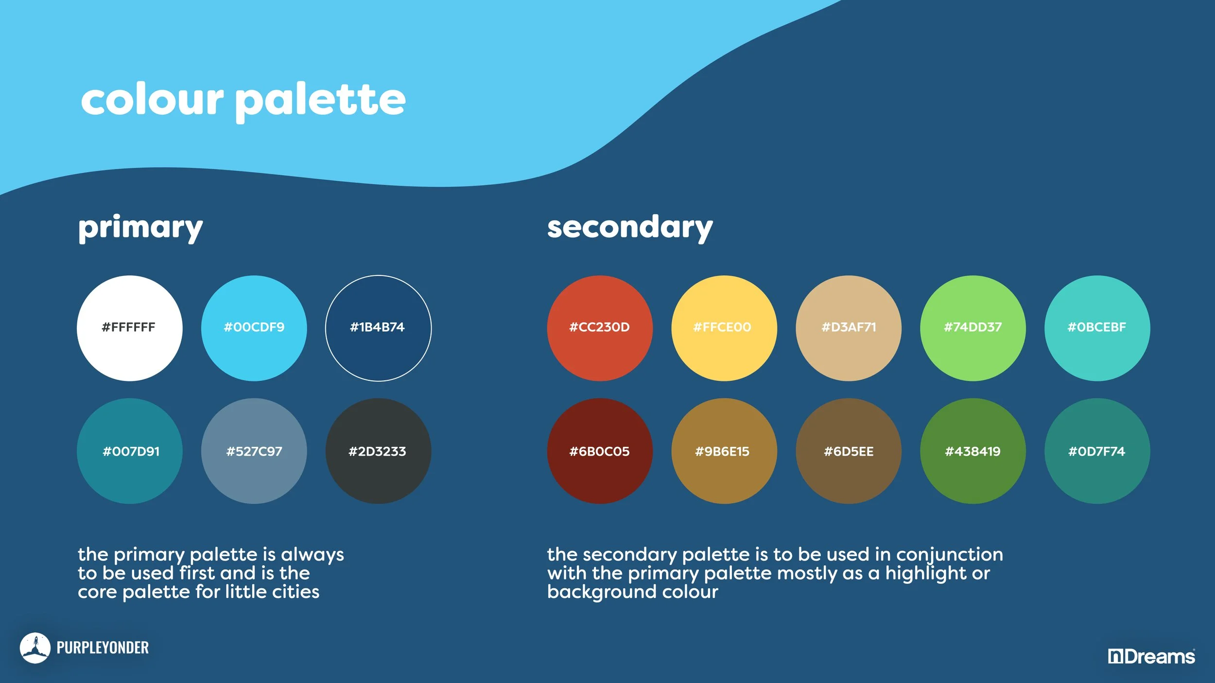
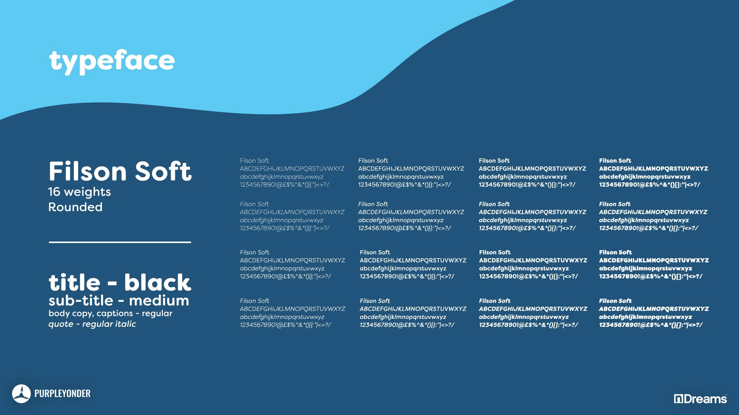
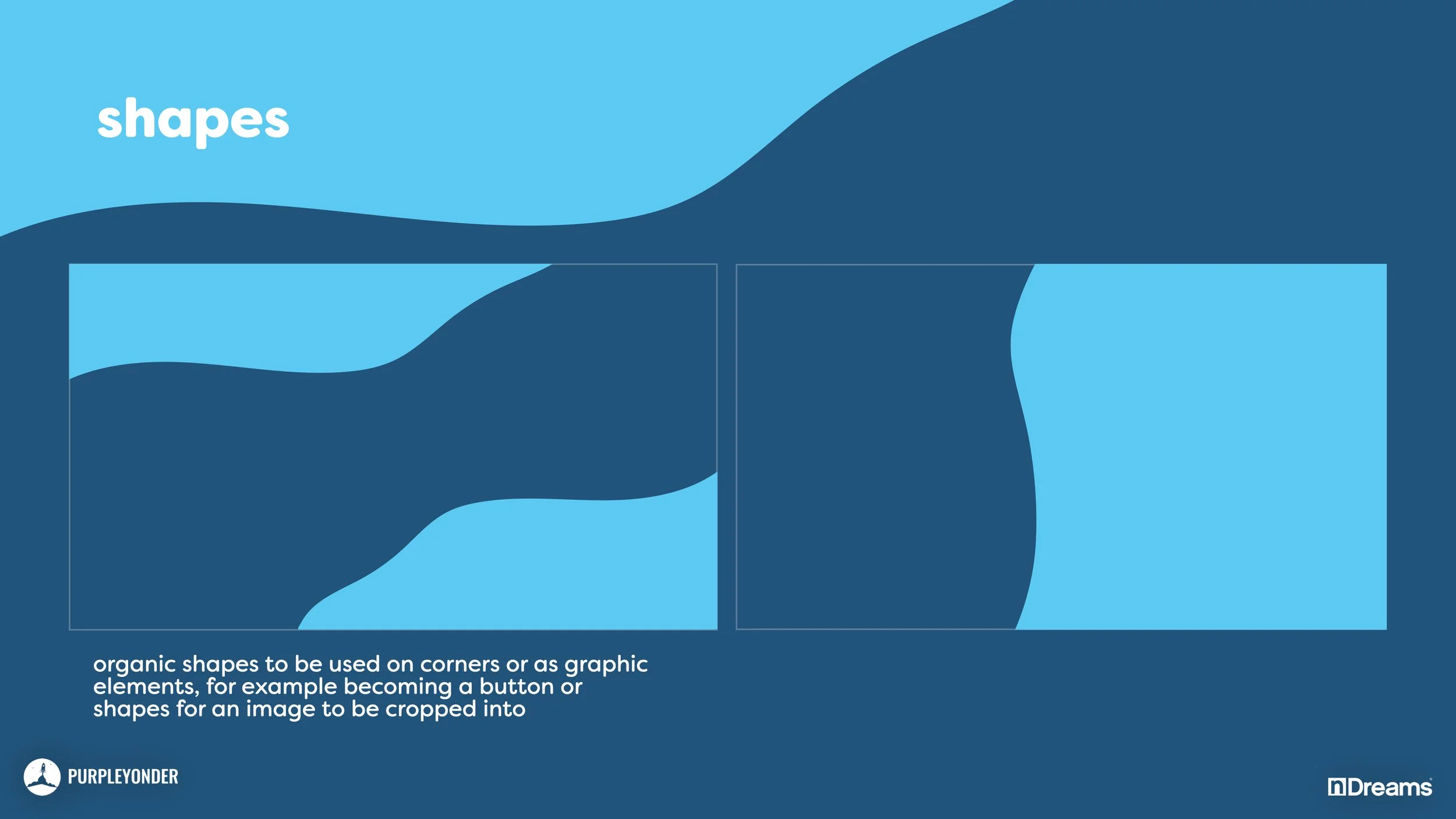
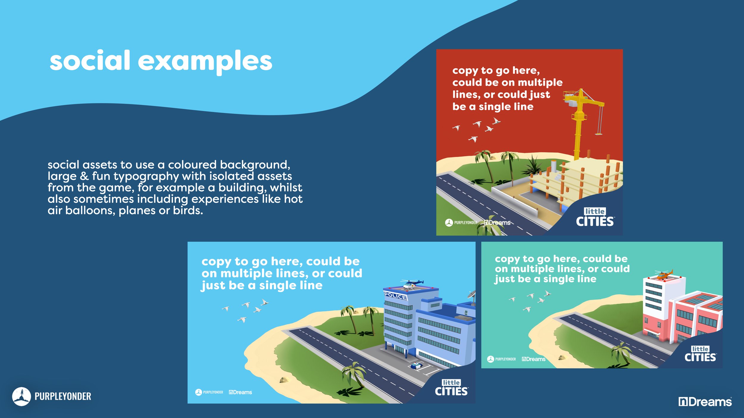
Drawing inspiration from the existing logo, the brand identity for this project aims to evoke a cozy and charming ambiance across various touchpoints, including social media, presentations, and store assets. To maintain a cohesive visual style, a warm and inviting colour palette is curated, featuring soft pastel tones alongside earthy hues. The typeface selection leans towards friendly and approachable, enhancing the brand's tone. A custom blob motif serves as a versatile container for copy and other elements, ensuring flexibility across different scenarios, including video trailers where it can dynamically house text from various corners of the screen. Rounded corners are employed consistently throughout all strokes and custom shapes to further reinforce the brand's positioning. Future logo iterations for updates will build upon the core logo, aiming to enhance it while retaining its essence. Each DLC logo will reflect the theme of the update, offering a unique visual representation to engage consumers while maintaining brand coherence.